Logo Anatomy
The Just Web Agency™ logo is made of two distinct components. Understanding them helps you apply the right version in every context.

The geometric checkmark is the brand mark. It can stand alone as an icon, favicon, or app mark.
The typeset name. Cannot be used on its own — it must always appear alongside the checkmark symbol. Always include the ™ trademark symbol in text.
All Logo Versions
Six variants cover every use case — from desktop headers to dark backgrounds to tiny favicons. Choose based on layout, background color, and available space.
The default logo. Symbol on the left, wordmark on the right. Use this for desktop headers, documents, and any wide layout on a light or white background.


White version of the horizontal logo. Use over the brand Deep Blue, dark sections, dark hero banners, or any dark-colored navigation bar.
Stacked layout: symbol on top, wordmark centered below. Preferred for mobile headers, narrow sidebars, square placements, and any layout under 768 px wide.
White stacked logo for dark narrow spaces — mobile headers on dark themes, dark sidebars, or any tight vertical slot that sits over a dark background.
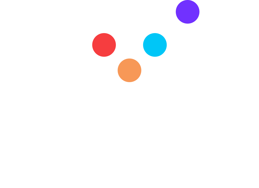

The standalone checkmark mark. Use as a favicon, app icon, badge, social media avatar, or anywhere the full wordmark cannot fit. The symbol may be used independently.

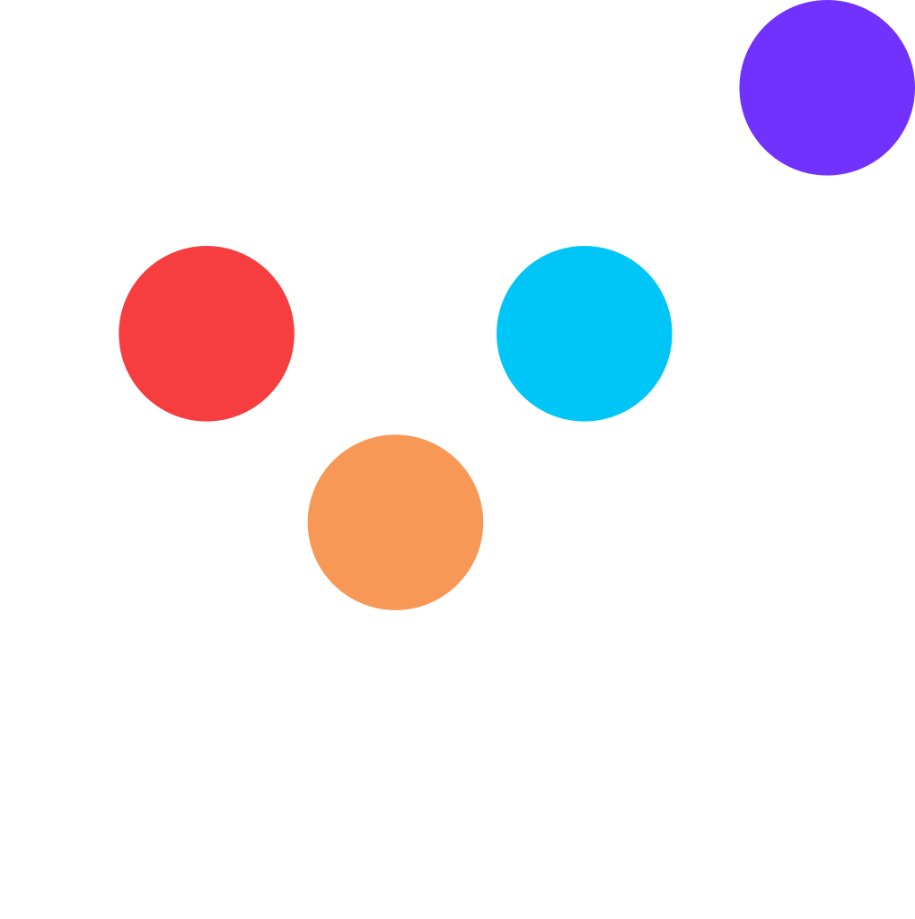
White checkmark for dark backgrounds. Use as a reversed favicon, badge, or icon on Deep Blue, dark hero sections, or dark-themed interfaces.
Clear Space & Minimum Size
Always keep a protected zone around the logo free of text, imagery, and other elements. Never scale the horizontal logo below 200 px wide.
The dashed border represents the minimum clear space required on all four sides of the logo. The recommended clear space is 15 px for the horizontal/vertical logo and 4 px for the symbol-only mark. On mobile layouts reduce to 12 px.
Do's & Don'ts
These rules protect the brand. When in doubt, default to the primary horizontal blue logo on a white or light-gray background.
✓ Do
- Always use the official provided logo files
- Include the ™ trademark symbol after "Just Web Agency"
- Maintain proportions and aspect ratio when scaling
- Ensure adequate clear space (15 px) on all sides
- Use the blue logo on light/white backgrounds
- Use the white logo on Deep Blue or dark backgrounds
- Use the vertical logo on mobile (<768 px) layouts
- Use SVG format whenever possible for sharpness at all sizes
- Use the symbol alone when space is too tight for the full logo
- Maintain a minimum contrast ratio of 4.5 : 1 (WCAG AA)
- Scale proportionally — preserve the original aspect ratio
✕ Don't
- Use the wordmark "Just Web Agency™" without the checkmark symbol
- Rotate, skew, flip, or distort the logo in any way
- Change the logo colors or apply gradients to it
- Add drop shadows, glows, outlines, or borders to the logo
- Scale the horizontal logo below 200 px wide
- Place the logo on backgrounds with insufficient contrast
- Combine elements from different logo variants
- Stretch or squash the logo disproportionately
- Place the logo on busy or patterned backgrounds without testing contrast
- Use old or legacy logo files (jwa_logo_2022.jpg)
- Remove the ™ symbol from the wordmark in marketing materials
Color Palette
These colors appear in the logo and across all brand materials. Deep Blue is the primary logo color; Bright Red is reserved exclusively for primary CTA buttons.
Approved Color Combinations
Deep Blue is always the anchor. Pair it with one accent at a time — never stack three accents in the same composition.
Accessibility note. Contrast ratios above are measured against WCAG 2.1. White on Bright Red is 3.7 : 1 — it clears the 3 : 1 bar for large text (24 px, or 18.5 px bold) and UI components, but not the 4.5 : 1 bar for normal body text. Keep CTA labels at 18 px SemiBold or larger, and never set small print in white on red.
Montserrat — The Brand Typeface
Montserrat is the only typeface used by Just Web Agency™. Its geometric construction echoes the checkmark symbol, and four weights cover every level of hierarchy from hero headline to fine print.
Modern, geometric and highly legible on screen — it matches the logo's construction and gives the brand a confident, contemporary voice. Free and open source via Google Fonts, so it renders consistently across web, documents and slides.
Type Scale
Sizes are given as a range — use the lower end on mobile, the upper end on desktop. Colors below are the canonical brand values.
Loading the Font
Add the Google Fonts link to the <head> of every page, then reference the stack through a CSS variable.
<link rel="preconnect" href="https://fonts.googleapis.com">
<link rel="preconnect" href="https://fonts.gstatic.com" crossorigin>
<link href="https://fonts.googleapis.com/css2?family=Montserrat:wght@400;500;600;700&display=swap" rel="stylesheet">
HTML — place inside <head>. Only load the four brand weights; extra weights slow the page down for no design benefit.
How We Communicate
The same care that keeps the logo consistent applies to the words next to it. Every headline, caption and button label should sound like it came from the same team.
Professional yet approachable
Knowledgeable without being condescending. Confident, never lecturing.
Modern and innovative
Forward-thinking language that reflects where the web is going, not where it has been.
Collaborative
"We", "together", "partner". We work with clients, not for them.
Clear and concise
Avoid jargon. When a technical concept is unavoidable, explain it in plain language.
Messaging Pillars
Expertise
We know web design and development, end to end.
Partnership
We work with you, not for you — shared goals, shared decisions.
Innovation
We stay current with digital trends and bring them to the work.
Quality
Excellence in every project, at every level of detail.
Accessibility
We make the web better for everyone — WCAG 2.1 AA as a baseline.
Applications in Use
How the logo, colors and type come together across the four contexts the brand shows up in most.
GET STARTED
Website
Horizontal white logo in a Deep Blue header, max 70 px tall. Bright Red reserved for the single header CTA. Cyan for icons and dividers, Purple for creative sections.
Print & Stationery
Business cards use the white vertical logo on a full-bleed Deep Blue field. Letterhead carries a Deep Blue header bar with the horizontal white logo. Use CMYK or Pantone values for print, never HEX.
Social & Avatars
The symbol alone on Deep Blue for profile pictures and app icons — the one place the wordmark is correctly dropped. Profile banners use Deep Blue with a single accent color. Full specs in Avatars & App Icons.
Blue horizontal logo on a white header. One Bright Red CTA per email. Use PNG rather than SVG — several email clients still do not render SVG.
Avatars & App Icons
An avatar is a square, solid-background lockup of the checkmark symbol — the one context where the wordmark is correctly dropped. There are exactly two approved versions: the symbol on White, and the symbol on Deep Blue. Never build a third.
Deep Blue symbol centered on a solid White field. Use where the surrounding interface is dark or highly colored, and for browser favicons on light tabs. Reads as the lighter, quieter option.
White symbol centered on a solid Deep Blue field. This is the default avatar for all social profiles and app icons — the blue field carries the brand color, so the mark is recognizable even at 16 px.
Size Ladder
Rendered at true pixel size. The symbol holds its shape all the way down to 16 px because it is never cropped — the padding shrinks with the canvas, it does not disappear.
✓ Do
- Export square (1 : 1) at 512, 256, 128, 64, 48, 32 and 16 px
- Composite onto a solid White or Deep Blue field before uploading
- Keep the symbol at roughly 58 % of the canvas width, optically centered
- Default to White on Deep Blue for social profiles and app icons
- Check the result under a circular crop — most platforms mask to a circle
- Use PNG where the platform rejects SVG uploads
- Keep at least 4 px of clear space inside the frame at small sizes
✕ Don't
- Upload a transparent PNG — platforms composite it unpredictably
- Put the wordmark in an avatar; it is illegible below 128 px
- Enlarge the symbol to bleed off the edge of the frame
- Use Bright Red as an avatar background — red is CTA only
- Use Purple, Cyan, or Orange as an avatar background
- Add gradients, glows, drop shadows, or an outline ring to the mark
- Rotate or off-center the symbol inside the frame
Favicon & App Icon Markup
<!-- Modern browsers: the SVG symbol scales to any tab size -->
<link rel="icon" type="image/svg+xml"
      href="Just-Web-Agency_Symbol-Blue-Transparent-Background.svg">

<!-- PNG fallback + iOS home screen (composite on Deep Blue first) -->
<link rel="icon" type="image/png" sizes="32x32" href="jwa-avatar-32.png">
<link rel="apple-touch-icon" sizes="180x180" href="jwa-avatar-180.png">

<!-- Deep Blue browser theme so the tab matches the avatar -->
<meta name="theme-color" content="#03035B">
HTML — the SVG covers every modern browser; the PNGs cover iOS and older clients. Export the PNGs from the White-on-Deep-Blue avatar.
Developer Tokens
Drop these into any project to inherit the brand exactly. Every value below matches the palette, type scale and button specs on this page.
/* Just Web Agency™ — brand tokens */
:root {
  /* Brand colors */
  --jwa-deep-blue:   #03035B;  /* primary — trust      */
  --jwa-bright-red:  #F63D3F;  /* CTA ONLY — action    */
  --jwa-purple:      #7131FF;  /* creativity           */
  --jwa-cyan:        #00C6F7;  /* communication        */
  --jwa-orange:      #F79857;  /* enthusiasm           */

  /* Neutrals */
  --jwa-white:       #FFFFFF;
  --jwa-black:       #000000;
  --jwa-light-gray:  #F5F7FA;  /* section backgrounds  */
  --jwa-medium-gray: #E2E8F0;  /* borders, disabled    */
  --jwa-text-body:   #333333;
  --jwa-text-muted:  #666666;

  /* Typography */
  --font-primary: 'Montserrat', -apple-system, BlinkMacSystemFont, 'Segoe UI', sans-serif;
  --font-weight-regular:  400;
  --font-weight-medium:   500;
  --font-weight-semibold: 600;
  --font-weight-bold:     700;

  --h1-size: 2.25rem;  --h1-weight: 700;  --h1-color: var(--jwa-deep-blue);
  --h2-size: 1.75rem;  --h2-weight: 600;  --h2-color: var(--jwa-deep-blue);
  --h3-size: 1.25rem;  --h3-weight: 600;  --h3-color: var(--jwa-deep-blue);
  --body-size: 1rem;   --body-weight: 400; --body-color: var(--jwa-text-body);

  /* Buttons */
  --button-size:      1rem;
  --button-weight:    600;
  --button-color:     var(--jwa-white);
  --button-bg:        var(--jwa-bright-red);
  --button-bg-hover:  #E02B2E;
  --button-bg-active: #C81E21;
  --button-radius:    8px;
}
CSS custom properties — colors, type scale and button tokens.
/* Primary CTA — the only correct use of Bright Red */
.btn-primary {
  background-color: var(--button-bg);
  color: var(--button-color);
  font-family: var(--font-primary);
  font-weight: var(--button-weight);
  font-size: var(--button-size);
  padding: 12px 24px;
  border: none;
  border-radius: var(--button-radius);
  cursor: pointer;
  transition: all .3s ease;
}
.btn-primary:hover {
  background-color: var(--button-bg-hover);
  box-shadow: 0 4px 12px rgba(246, 61, 63, .35);
  transform: translateY(-2px);
}
.btn-primary:active {
  background-color: var(--button-bg-active);
  transform: translateY(0);
  box-shadow: 0 2px 6px rgba(246, 61, 63, .25) inset;
}
.btn-primary:focus-visible {
  outline: 3px solid var(--jwa-deep-blue);
  outline-offset: 2px;
}
.btn-primary:disabled {
  background-color: var(--jwa-medium-gray);
  color: #9CA3AF;
  cursor: not-allowed;
  opacity: .6;
}
CSS — the primary button and all five of its states.
<!-- Responsive logo: horizontal on desktop, vertical under 768px -->
<picture>
  <source media="(max-width: 767px)"
          srcset="Just-Web-Agency_Logo-Blue-Vertical-Transparent-Background.svg">
  <img src="Just-Web-Agency_Logo-Blue-Transparent-Background.svg"
       alt="Just Web Agency" width="300">
</picture>
HTML — the 768 px breakpoint switch, using the official transparent SVGs.
Trademark & Usage Rights
Just Web Agency™ is a registered trademark. The ™ symbol must follow the name in all branding and marketing materials.
Trademark registration granted for the Just Web Agency name and mark.
Trademark registration granted for the Just Web Agency name and mark.
Always write "Just Web Agency™". The ® symbol is reserved for specific jurisdictions and is not used.
The wordmark must always appear with the checkmark symbol. The only exception is legal fine print and trademark filings.
Deprecated files. Do not use jwa_logo_2022.jpg or any other legacy asset for new materials. Every current, approved file is downloadable from the Logo Variants section above.